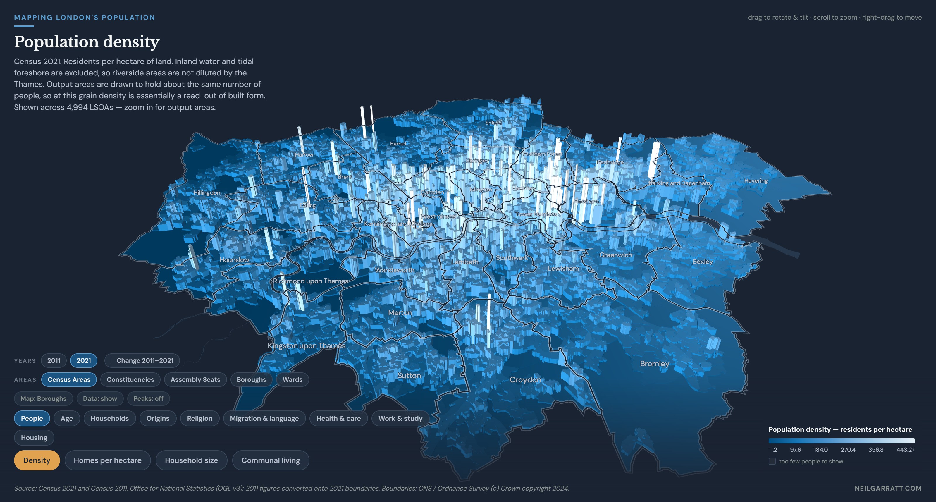
Explore London’s census. View 62 measures covering 9 categories: population, age, households, origins, religion, migration & language, health & care, work & study, and housing — 57 in both the 2011 and 2021 censuses to see what changed. Zoom in, rotate, choose the map scale. On a computer? Try the full screen button.
London is not one place
Neighbouring places can be starkly different while whole swathes of the city can be similar. The census is both a snapshot in time and a treasure trove of data, from which I have turned the raw numbers of 62 census measures from 2021 and 57 from 2011 into an explorable map.
The census publishes results down to 26,369 output areas, small blocks of about 330 people or 130 households. Zoomed out, the map switches to the catchily named Lower Super Output Areas which group the OAs into 4,994 larger areas.
Or your own patch
Nobody lives in an “output area”, so the map will also build the census areas into some more familiar geography: the 33 boroughs, the 75 parliamentary constituencies, the 14 London Assembly seats, and 689 council wards. Click a borough or constituency for its Fact File, showing where its figures are unusually high or low. And you can add a street map overlay to get your bearings. Though see note below on wards and constituencies.
Time travel
The top row of buttons switches between 2011 and 2021, while Change shows the difference between them. Bar height show the size of the change and colour for its direction: blue for rising, amber for falling.
Five of the 62 measures have no 2011 figure — passports, arrivals since last census, the two household-language measures, and the retired breakdown.
How to read it
Height and colour usually show the same thing Taller and paler means more, the scale bottom right shows the actual range for each measure. Though some map settings use amber as well as blue, see notes below.
Zoom in and the map adjusts between OAs and LSOA if you pick Census Areas, but any other area type stays put.
Where the 2011 figure is an estimate, the map says so. Hover on the 2011 or Change views and it will tell you if some of the older figures were shared out rather than measured. Boroughs and Assembly seats never are.
Almost everything is a percentage not a count. Of households, of people, or of a subset of people. The one exception is density which is people per hectare, and because population is roughly equal across OAs and LSOAs is effectively shows you the built form.
The top and bottom announce themselves. Pick a measure and the peak areas ping in a quick wave that finishes on the very highest one, or you can switch to “lowest”. Hovering any area gives you its rank as well as its figure.
One measure diverges from a meaningful zero. The age-adjusted health measure in Health & care is centred on 100, which is the London average for a place with that age profile. It rises in both directions so height is how far an area sits from what its age profile predicts, colour is which way: amber for worse health, blue for better.
You can change the base map. The default draws borough outlines on ink. Switch to Street for an OpenStreetMap base, and hide the data layer if you want to see the map more clearly.
Both censuses are always in the tooltip. Whichever year you are looking at, hovering an area gives you its 2011 figure, its 2021 figure, and the change between them.
Notes and Observations
The 2021 census is a snapshot from March, taken during a lockdown. Student and worker populations were displaced, and that shows in some central and university areas.
Small numbers are deliberately fuzzed. ONS applies statistical disclosure control, nudging small counts up or down by one or two so individuals cannot be identified, this mainly affects OAs.
It counts where people sleep, not where they are. The City of London has about 8,600 residents and roughly 600,000 weekday workers. Residential measures there describe almost nobody who is actually in the Square Mile on an average Tuesday. The same is true in a milder way across the city centre.
2011 is counted on 2021’s boundaries. Where a 2011 output area was unchanged, its figures are carried across and are exact, which covers 92% of Londoners. Where areas were split or merged, the old count is shared between the new areas in proportion to how many people or households each holds today. Because none of that sharing ever crosses a borough boundary, the borough and Assembly seat figures are exact, and every one of them reproduces ONS’s own published 2011 borough figures. Constituencies are 99.9% exact, wards 98.9%, neighbourhoods 98%, and individual output areas 92%.
Age-adjusted health uses one fixed yardstick for both years On the level views amber means worse health than the area’s age mix predicts; on the Change view amber means the figure fell, which for this measure is an improvement. The map’s own caption says which you are looking at.
Wards and constituencies are approximate at the edges. Output areas were drawn in 2021 to fit the wards of the day, and many London wards were redrawn in 2022. ONS assigns each output area to whichever ward or constituency holds most of it, and this map follows their OA assignment. So a ward here is “the output areas ONS puts in that ward” not the exact council ward boundary, I’m afraid this is the best that can be done with census data. In practice a typical ward’s population is within ~2%, and 90% are within 5%, but the shape can wander at the edges.
Overcrowding is ONS’s occupancy rating for bedrooms. A household is taken to need one bedroom for each couple or lone parent, one for anyone else aged over 20, one for each pair of same-sex 10 to 20 year-olds, while children under 10 pair up whatever their sex. Subtract needed bedrooms from available bedrooms, if the result is below 0 then the household is deemed overcrowded.
Sources
Census 2021 topic summary tables and Census 2011 key statistics, quick statistics and local characteristics tables, Office for National Statistics, via Nomis, under the Open Government Licence v3.0. The 2011 to 2021 output area change lookup is also ONS. Boundaries are ONS 2021 output areas, generalised and clipped to the coastline; areas are ONS Standard Area Measurements, using land area only so that riverside neighbourhoods are not diluted. Yes, you read all the way to the bottom for a “diluted” pun. Contains OS data © Crown copyright and database right 2024. The lovely 3D map is built using Deck.gl, the street map uses Open Street Map © CARTO.