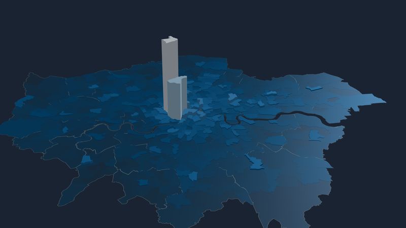
Why do journeys across outer London take so long, and why does it matter for jobs, opportunity, and quality of life?
Exploring the problem: Outer London Access Time
One half of London can’t understand why anyone would own a car, the other can’t understand why anyone would bother with a bike. My unpopular opinion is that most people are making rational choices and this page will show you why.
In transport terms, London is a city of two halves and the two halves often don’t understand each other. Worse, one half tends to make most of the decisions. I explored this in some detail in an article for the excellent Greater London project, “A tale of two sub-regional urban zones”. This page builds on that.
So if you don’t get why most outer-London households own a car, including a majority of even the poorest 10%, or why there’s so much talk about cycling when you rarely see a bike in your part of London, read on. I built this map to tackle that knowledge gap.
Interactive Journey Time Map
Croydon
Metropolitan centre in Croydon
Modes: public transport & walking
What if..?
Mapping options
45 min
Map layers & landmarks
Cars or vans per household
00.511.52
Census 2021 · TS045 · LSOA · OGL v3
Jobs per hectare
031671300+
BRES 2024 · LSOA · ONS via Nomis · OGL v3
Mean journey times across London from the selected town centre, departing on a Tuesday morning between 7.30am and 8.30am. Click or tap a borough on the map, then pick one of its town centres. Open Mapping options to compare modes or draw an isochrone, and Map layers to overlay the rail network or a street map.
UPDATE: several new features including “What if?” models with proposed lines, map overlays to get your bearings, map zoom, and a “landscape big mode” that works especially well on a computer or rotated tablet. Note: The zoom has also revealed some curious anomalies where a few points wrongly show as completely unreachable, I assume because of something in the OSM used for walking routing. I’m investigating.
Step-Free Although this dramatically affects the reachable area in many places, my model is actually too optimistic. It only models step-free to platform not step-free to train, and it doesn’t take into account either the extra time to travel through a station, or the fact that some station interchanges are not step-free even if part of the station is. I am working on adding at least some of this, but although TfL’s station accessibility data is excellent, national rail’s isn’t, plus the R5 routing engine can’t handle every permutation. Also, it assumes every lift is working which, too often, they aren’t.
What It Does And How It Works
Using the R5R transport routing engine, I’ve built OLAT: the Outer London Access Time map, a colour-coded map of travel times between all parts of London. Blue and green areas show places that are reachable within 45 mins, these are the places that are “in range” for someone looking for work, for example. Feel free to use it to find potential places to live!
The interactive OLAT map allows you to explore how large those easy-travel zones are for well-connected boroughs, and how limited they are for others. Within each borough, you can select from a range of named places, these are the 201 centres in the Mayor’s London Plan, plus Bank in the City of London.
In particular, notice that for many outer London boroughs getting to relatively nearby boroughs is slow and difficult: these are the orbital journeys that are often 2 to 3 times faster by car, even in busy traffic. For example, try Harold Hill in Havering, Selsdon in Croydon, or Northwood in Hillingdon.
Public transport journey time calculation is based on all London public transport including Tube, DLR, Tram, Overground, Elizabeth Line, London buses including Superloop, national rail services, and walking. Cycling and driving are not included (see below). Journey times are the mean travel time between 7.30am and 8.30am on a Tuesday morning, and take into account connection and waiting times, so this will be slower than the fastest possible journey especially where services are less frequent.
To see the impact of personal travel, the +E-Bike and +Car buttons redraw the map assuming you have one or both. It’s striking how big an area a car opens up in outer London, and how much a bike opens up especially across central and inner London. This is my “rational transport choices” theory in visual form.
The e-bike option assumes you travel at an average of 12mph for a max of 30 mins, and it assumes an e-bike is available at both ends of a public transport journey, which in practice it might not be.
The car option attempts to model congestion by taking the Open Street Map journey time and adding a 20% speed reduction in outer London, 40% in inner London, and 60% in central London. It looks reasonable in outer London, but may understate peak time congestion in the city centre.
I’ve done my best to model London’s enormously complex transport system in this one small map, but I am just one man. Please do check against authoritative sources such as TfL before you do anything important with this information.